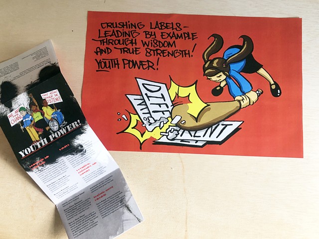
Youth Power! promotional design
The brochure needed to appeal to teens, and feel like this program was not just directed at them by adults, but for them. The client had used this artwork for other promotional materials, so we included it here. I proposed that one side be a cool poster so that the brochure would be kept or shared. The typography and layout followed the graffiti theme in the artwork.
Artwork by Thom Holt.
